
A watermelon box can tell you where it grew
A pale green and white carton from Niigata's Yairokko watermelon brand echoes the striped skin of the fruit inside. In Kanazawa, Ishikawa Prefecture, a bold red circle represents a watermelon, with one seed shaped like the five petals of a kaga umebachi, a motif associated with the city. Both designs give an everyday shipping container a second job: telling shoppers about the product and the place that grew it.
Contents
- A watermelon box can tell you where it grew
- Protection starts with the cardboard
- Simple pictures make the contents clear
- Mountains, mascots and jokes identify local farms
- Gift fruit brings a different kind of presentation
- Keeping strawberries still and shipments cool
- Less packaging must still mean enough protection
- Fruit decoration has a history beyond cardboard
- What the designs give farmers and shoppers
- Key Points
Japanese fruit packaging is often associated with expensive gifts, from musk melons tucked into tissue paper to rare Taiyo no Tamago mangoes that attract auction bids in the hundreds of thousands of yen. The less obvious story is how much design attention also goes into ordinary produce cartons. Watermelon sellers compete through their fruit and through the boxes carrying it.
Summer markets display this care in stacks of cardboard as well as in the peaches and melons themselves. Colors, illustrations and local emblems help customers recognize what is inside without having to read every label. A box can communicate freshness, season and the identity of a grower or region while remaining a practical container.
Japan treats packaging as a craft, and fruit boxes bring together two demands that must work in the same small space. They have to stack securely, allow air to move and protect food that bruises easily. They also give producers a recognizable public face. The result is a purchase that carries a small story about where the fruit comes from and the care behind it.
Protection starts with the cardboard
Cardboard strength, coatings that withstand condensation and openings that let air circulate are basic considerations in fruit packaging. Condensation is the moisture that can collect on a cold surface. A carton must remain useful when damp, while its handles and arrows showing which way is up encourage careful handling.
Producers and agricultural cooperatives select the fluting and thickness of their cardboard according to travel distance and humidity. Fluting is the corrugated layer that helps give the board its strength. Vent openings are positioned to work with pallets and cooling equipment so that chilled air can circulate around produce in storage.
Corners cut to shape can absorb bumps, and inks must resist smearing when the box gets wet. Clear markings for the top and bottom help prevent delicate stems from being placed under pressure. These details are modest engineering responses to the repeated lifting, stacking and movement involved in getting fruit to a shop.
Inside, molded trays cradle nectarines or grapes, tissue paper cushions apples against scuffing, and rigid compartments keep strawberries from hitting each other. The customer does not need a set of instructions for these protections to work. The shape and arrangement of the packaging do the work themselves.
Printing also helps the people moving and selling the produce. Color and recognizable images allow workers to identify varieties and sizes at a glance on a busy loading dock or supermarket floor. A well designed box therefore has to be readable as well as strong.
Simple pictures make the contents clear
Japanese consumer packaging has a tradition of straightforward communication, and produce cartons carry that approach into everyday shopping. Simple pictograms can indicate whether fruit has seeds, whether it belongs to an early or late season crop, or how many pieces sit in a tray. Large, legible lettering makes those details easier to find.
Many boxes show the actual fruit through a clean illustration rather than an imagined or exaggerated scene. The aim is trust: the first impression created by the outside should match what the customer finds inside. The artwork must attract attention while still doing the ordinary work of identifying food.
Niigata's rind pattern and Kanazawa's watermelon circle show how little visual information may be needed. The first uses the appearance of the fruit itself. The second adds a local reference through a single seed. Both connect product recognition with regional identity, turning a utilitarian carton into a small ambassador for its place of origin.
Yamagata growers have used a rising sun symbol that also reads as a round watermelon. The design links national imagery with practical labeling. These visual choices give familiar shapes more than one meaning without requiring a lengthy explanation on the box.
Mountains, mascots and jokes identify local farms
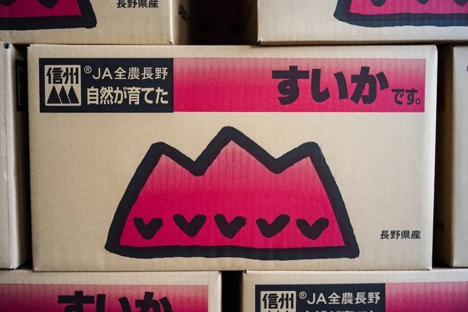
In Nagano, JA Matsumoto Highlands uses a serrated mountain line that local people associate with the prefecture. Its latest version places a watermelon slice among the peaks on a side panel, making the product easy to recognize from two aisles away. The landscape becomes part of the fruit's identity.
The same mountain motif appears on lettuce and green onion packaging from regional cooperatives. Repeating it across different crops creates a family resemblance. A shopper can recognize a regional connection even when the contents change from one vegetable or fruit to another.
Vegetable cartons also make room for humor. A box from Kunneppu in Hokkaido shows brown and white onions together, referring to their unpeeled and peeled appearances. Garlic cartons from Oirase in Aomori use a drawing of a bulb that can also look like a nose, making the product memorable through a visual joke.
Mascots give stacks of produce a friendly face. Gunma chan appears holding an eggplant, while Vejita kun has a tomato for a head. Alongside mountains, crests and fruit illustrations, these characters help distinguish cartons that might otherwise look anonymous.
Collectors photograph the boxes, and some designs attract a small following. In a recent project in the Matsumoto area, junior high students turned regional produce cartons into miniature gachapon toys, the small collectibles sold in capsules. Their replicas included boxes for watermelon, Chinese yams, green onions, apples and burdock.
The miniature cartons were sold locally. They celebrated nearby farms in much the same way as the full size containers, while showing that an agricultural design can attract attention beyond the produce aisle. A box intended for shipping can become an object people choose to keep.
Gift fruit brings a different kind of presentation
Fruit gifting is deeply rooted in Japan. People taking omiyage, gifts for colleagues or relatives, may choose a flawless peach or a velvety melon in a handsome box as a gesture of care. Top grade fruit receives a more ceremonial presentation than ordinary produce.
Retail staff nestle individual pieces into crinkled paper and place them in rigid boxes that open like jewelry cases. The packaging protects the fruit while making the act of opening it part of the occasion. A single piece of produce becomes something to present and admire.
A fancy melon can cost around 10,000 yen. Rare fruit and fruit from the first harvest sold at auctions across Japan can reach much higher prices. Miyazaki Prefecture's Taiyo no Tamago mangoes, known for their glowing red skin, are selected according to strict standards for size and sweetness, and the best examples command premium prices.
The box helps communicate that rarity and protects a surface that could bruise in a casual crate. Its appearance and its protective role serve the same purpose: keeping the fruit in the condition that gives it value.
That presentation also travels overseas. Luxury strawberries from Kyoto have appeared in specialty food halls in London, arranged in precise trays with every berry aligned. They undergo dozens of checks, are picked at the right hour, chilled and shipped in packaging that holds each strawberry in place.
Whether the counter is in Tokyo or overseas, the intended experience is the same. Opening the lid reveals carefully arranged fruit whose appearance matches the illustration on the label.
Keeping strawberries still and shipments cool
Strawberries need more protection than an attractive lid. Japanese growers and packers combine careful grading with interiors designed for fragile fruit. In one approach, sometimes called a cradle style pack, each berry sits in a separate compartment above a cushioned base.
The tray stops berries from rubbing against one another, while the lid helps keep humidity steady. The dimensions are designed to guarantee the weight declared on the label. After a final inspection, the tray goes into a stiffer outer box for transport.
Temperature control continues from the greenhouse through the aircraft journey to the store. This sequence is the cold chain: keeping food chilled as it passes through the different stages of transport and sale. A protective interior is only part of the system, because cold air also needs enough space to move.
Vents and spacers are calculated as part of the packaging design. This attention to transport helps peaches from Yamanashi and grapes from Nagano reach Hong Kong or Taiwan with their bloom intact, the surface finish that contributes to their fresh appearance. The packaging preserves the farmers' work during the growing season.
New technology can add information to that physical protection. Time temperature indicators can flag interruptions in the cold chain. Sensors can detect ethylene, the gas that speeds ripening, or monitor humidity and leaks. Some systems use simple radio frequency identification tags, known as RFID tags, to record a history of handling.
These tools are still developing, and questions about their cost and waste remain. Their purpose is practical: information from inside the box can help identify problems during transport, reduce losses and deliver fruit in better condition.
Less packaging must still mean enough protection
Fruit packaging creates a difficult balance in discussions about waste. Layers that stop damage can prevent spoilage, yet extra material, particularly plastic, has an environmental cost. A lighter package is useful only when it can still protect the food it carries.
Research on fruit packaging shows that smaller packs often use more plastic per kilogram of fruit than larger packs. Boxed formats combining polymer windows and rigid trays can have the highest carbon footprint associated with their plastic per kilogram delivered. The amount of packaging has to be considered alongside the amount of fruit reaching the customer.
Designers have several ways to reduce material use while retaining protection:
- Use a single material where possible to make recycling simpler.
- Replace mixed plastic components with trays made from paper pulp.
- Choose inks based on water and keep adhesive use to a minimum.
- Fit boxes closely to the fruit so the packaging is not excessive for the amount inside.
- Use openings that show the contents instead of adding plastic windows.
Japan has an established community of packaging engineers and a culture of design awards, with fruit boxes forming part of that discussion. Many cooperatives already use recycled cardboard for the outer layer and keep plastic parts light and removable.
Returnable crates circulate through wholesale channels for shorter journeys. There is still room to reduce waste, and useful ideas can spread quickly when a few large growers adopt them. The practical task is to use fewer resources while keeping the protective features that prevent fruit from being lost.
Fruit decoration has a history beyond cardboard
In the Meiji period, lacquer artist Shibata Zeshin designed a tiered food box decorated with summer and autumn fruits. Grapes, melons, loquats and pears appear against a dark background in metal and colored lacquer. Intended for festive servings, it treated the same kinds of produce found in markets as subjects worthy of fine decoration.
The Metropolitan Museum of Art holds a Zeshin food box with fruit motifs dating to the late nineteenth century. Its collection entry provides images, information about the object and its maker, and details of the lacquer techniques used.
The museum object and today's shipping cartons serve different purposes, yet both make food part of the container's artistic language. One was made for a festive table. The other must survive storage and transport. Fruit remains the subject that connects appearance, craftsmanship and use.
What the designs give farmers and shoppers
Farmers work in a trade where fruit spoils, shapes vary and weather changes the supply. Thoughtful packaging gives them a consistent way to identify their produce through those changes. A city crest on a watermelon carton or a mountain line associated with a valley connects the fruit to people and place.
The commercial benefits include easier sorting for grocers and distributors, fewer identification mistakes and tidier shelves. Distinctive artwork can stay in a shopper's memory and influence the next purchase. Even a small interest among collectors can help turn an otherwise ordinary commodity into a recognizable brand.
Student projects such as the miniature Matsumoto cartons show how that identity can reach beyond retail. Mascots also give children a reason to notice vegetables and learn their names. Seasonal colors remind shoppers which crops are ripening, while carefully presented gifts encourage appreciation for the work behind a single peach.
A successful fruit box brings design, transport and care together. Its strongest feature may be the way those jobs support each other: a recognizable carton helps people handle and identify the produce, while a protective interior keeps it looking as the label promises. Farmers gain pride in its presentation, and customers gain confidence in what they buy.
Key Points
- Japanese fruit boxes combine physical protection, clear labeling and regional identity.
- Niigata rind patterns, Kanazawa's kaga umebachi motif and Nagano mountain imagery connect produce with its origin.
- Mascots, visual jokes and miniature carton collectibles give everyday farm packaging an audience beyond shoppers.
- Gift fruit receives careful presentation, with fancy melons costing around 10,000 yen and rare auction fruit reaching much higher prices.
- Individual compartments and temperature control help delicate fruit survive journeys to domestic and overseas stores.
- Indicators, sensors and RFID tags can provide information about transport conditions, although cost and waste remain concerns.
- Paper pulp, removable components, closer sizing and returnable crates offer ways to reduce packaging waste.
- Shibata Zeshin's fruit decorated food box shows an older tradition of making produce part of container artistry.